![]()
FoRWARD
Adam Smith
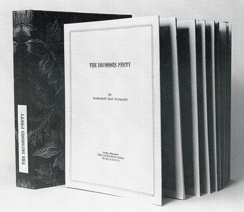
The Art of the Book, the fifth anniversary exhibition of the Canadian Bookbinders and Book Artists Guild, marks a turning point in the development of the book arts in Canada. The exhibition, composed of 48 objects drawn from over 140 entries, attests to the strength of the growing community in this country who view the individually produced book as a fertile ground for personal expression. This strong response to a juried exhibition organized by an organization only five years old reflects the need that has been felt for opportunities to exhibit, and their relative paucity.
The objects in the exhibition reveal an enormous variety of inspiration, as is natural with an object as rich in symbolic, historical, and personal meaning as the book. The book has always reflected hidden meaning, religious or mystical truth. It has always been a prime vector for the mutation, evolution, and the shaping of culture. It has always been an object capable of developing a warm, and important relationship with the reflective owner. The feel of the book, and the pleasure to be had in its sequential revelation of its secrets has always been felt, by some, as ajoy. For many, many people, books are their most cherished possessions. It should come as no surprise, then, that a group of artists has arisen that see the book form as an inspiration, or a challenge, or simply as their natural medium.
The Art of The Book was judged in six categories: Artists' Books, Fine Printing, Bookbinding, Calligraphy, Decorated Paper and Papermaking, and Boxmaking. It may seem to have been a curious decision to segment and categorize the work, but in fact the categories are very distinct, if overlapping, worlds. Each has its own approach to the nature of the book and its importance, each its own customary idiom. A view of all together makes possible a far greater understanding of the medium than any singly, and this was one of the original motivations behind the organizing of The Art of the Book.
It will be interesting to many that a Canadian guild's exhibition should include participants from outside Canada. This fact accurately reflects the international nature of the book arts community today. Many of the non-Canadian participants have attended or given workshops in this country, and the Israeli participant, Yehudah Miklaf trained several of the other exhibitors, during his time as an instructor at the Sheridan College School of Crafts and Design. The exhibition committee made the decision very early, to welcome CBBAG's non-Canadian members' submission to the exhibition, in honour of their contribution to the Canadian Book Arts; and to recognize as well the welcome that such organizations as The Designer Bookbinders (England), the Guild of Bookworkers (U.S.A.), and the Germaine de Coster Competition (France), have given to Canadian Book Artists. The appreciation of a show comprising such diverse influences and intentions makes real demands on a viewer, and we felt that a catalogue to aid in its understanding would be vital. It is my hope that this catalogue will be a book of worth in its own right, and as a result I am delighted by the agreement of Gloria Hickey to provide a critical overview of the show. The exceptional photographs by photographer Thomas Moore, and production by the excellent firms of H & S Reliance, Cooper & Beatty, and Bryant Press are also assets which I truly appreciate.
The field of book conservation is an enormously important focus for the Canadian Bookbinders and Book Artists Guild, and I feel some regret at the decision that it could not reasonably be included in this exhibition. The problem, of course, is that a really good conservation project may be unobtrusive to the point of being invisible. Conservation practice has had a definite influence on the exhibition however, and its presence may be felt very clearly with the assistance of Betsy Palmer Eldridge's thoughtful article on the subject. We are proud to offer this essay, by one who has made a distinguished contribution to that field.
It has been a pleasure, albeit a sometimes arduous one, to participate in the creation of The Art of the Book. I am delighted that the members of CBBAG through their submissions have demonstrated so strongly the vitality of the Canadian Book Arts.
TORONTO, June 1988
![]()
exhibition schedule
8 September - 2 October 1988
Ontario Crafts Council, Toronto, Ontario
18 November - 16 December 1988
The Killam Library, Dalhousie University, Halifax, Nova Scotia
12 January - 26 February 1989
Art Gallery of Greater Victoria, Victoria, British Coumbia
March 3 - 26 1989
Burnaby Art Gallery, Burnaby, British Columbia
12 June - 21 July 1989
Stewart Hall Art Gallery, Pointe Claire, Québec
![]()
An Appreciation: The Art of the Book
Gloria Hickey
In response to CBBAG's call for entry 140 fine books, boxes, papers and samples of calligraphy were submitted from as far away as Israel. From this healthy international harvest the jurors skimmed off a cream of 45 entries, which form the body of this exhibition. The works reflect the diversity and creativity to presently to be found in the allied disciplines of book binding, fine printing, boxmaking, paper decorating and calligraphy. They offer an opportunity for aesthetic contemplation and all viewers should feel welcome in taking a second satisfying look.
Aesthetic contemplation is an integral mix of sensory delight, emotional enrichment and intellectual reward-functions which the lively arts of bookmaking are particularly suited to fulfill.
Examine Margaret Lock's edition of How much land does a man need? The wooden case has two functions: distinction and containment. Not only does it protect the finely printed book within, but it signals 'importance' to the viewer. Unfastening the tabs, we discover a book with pliable covers of fragrant kangaroo grass. Opening the covers, we find substantial pages of Bareham Green's Canterbury paper. The text of Tolstoy's novel is immaculately printed in 18-point Baskerville and the evocative illustrations have been drawn and cut by Margaret Lock in marine plywood. She and Frederick Lock have executed this book on an Eickoff proofing press. Even
without a technical understanding of the quality materials and highly developed skills required to produce such a book, their benefits are readily experienced and appreciated. The wooden case, the texture of the papers, and the controlled drama of the text and illustrations all contribute harmoniously towards a potent sobriety.
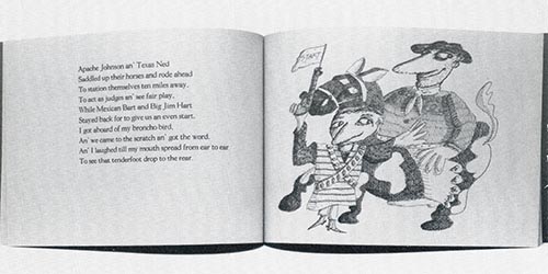
For a more lighthearted book consider Pamela Smith's printing of Bronco vs Bicycle. Also representing the category of fine printing, it is a product of the Press of the Palace of Governors in Santa Fe, New Mexico. Smith's choice of Goudy Light type face for the text was an excellent one. That face's engaging, and easy-on-the-eyes clarity is ideal for the purposes of the verse. Also note how the design and printing conspire to coax the reader through the rollicking rhythms of this Old West tale set to poetry.
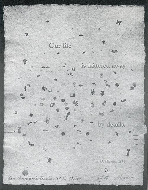
John Risseeuw's Even Transcendentalists Get the Blues embodies a 1854 sentiment of Henry Thoreau. It is an unbleached, soft-surface paper of card weight, imprinted with the phrase 'our life is frittered away by details.' Sharing the page are representations of the flotsam and jetsam of everyday life: strawberries, stockings, dollar bills, and butterflies. Despite the wistful tone of the quote, the colours and placement of the printed elements make a pleasing composition.
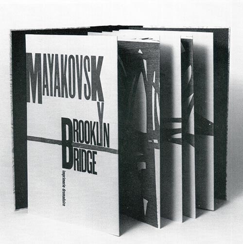
Glenn Goluska's fine handprinting of Brooklyn Bridge literally stands out. It unfolds accordion style to become a freestanding, three dimensional metaphor for the bridge itself. The spare text is visually suspended between the woodcuts (also by the printer). Suminagahi, Japanese marbled paper, on the covers suggests rippling water.
Approximately one third of the work in this exhibition is focused on bookbinding. Most of the books are accompanied by sleeves or boxes. These are the first thing a viewer encounters, and as such can be an effective way of introducing the contents of the book to the potential reader. The various elements of the book's binding are further pieces of information about the book. A binder may express his creativity in how he manipulates the complementary or contrasting relationships between the sleeve, cover papers, inside leaves and so on. The cumulative effect is, in essence, the binder's interpretation of the author's work.
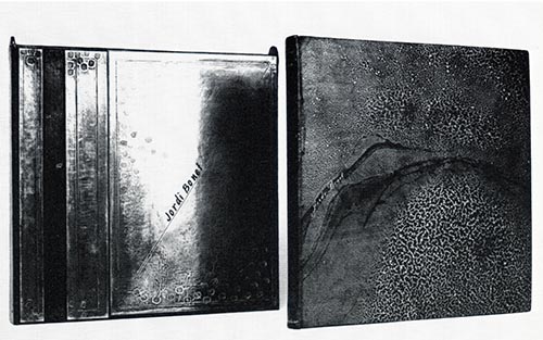
For a demonstration of this function, investigate Pierrette McCullough's binding of Jordi Bonet. The book's subject is a poignant portrait of a painter and muralist who experienced great artistic accomplishment, as well as searing self doubts and ultimately a tragic end. The binding reflects and illuminates this theme. It is worked in black leather and pewter. The subtlety of the sombre cover gives way to a reflective foil inside. It is a contrasting flash of light, or life, that literally forces us to look at ourselves.
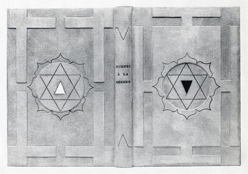
Herve Busatto's skin coloured suede binding of Hymnes à la Déesse suggests its Tantric theme. The symbols which decorate the cover are also consistent with the Hindu mystic rites devoted to the goddess Sakti. It is intriguing to see how Busatto has marked the front and back covers with opposing symbols. This nudges us to contemplate the front and back covers as metaphors for male and female, life and death, beginning and end.
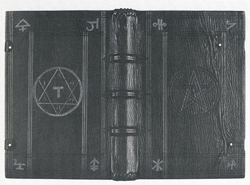
Don Taylor has also chosen symbols to communicate the essence of his book. His Faust is a weighty tome bearing a pentagram. Sinister metal hands clasp the book shut implying powerful secrets as black as the goatskin cover.
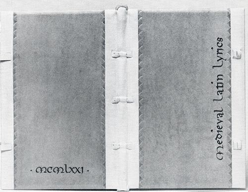
By way of contrast, examine the silk, cotton, and fibre ties on Elizabeth McKee's From A Circle of Love. These are caressing tendrils which complete the book's undulating calligraphy. The snug, alum tawed leather tabs of Beatrice Stock's Medieval Latin Lyrics also make a comforting counterpoint to the menacing Faust.
Bookbinding presents manifold technical challenges to the craftsman. Books are truly three dimensional objects, reading, and handling them is a process of comprehensive scrutiny. There are no hiding places for a binder's slips.
Annegret Hunter-Eisenbach masterfully conquers these technical and creative challenges in her binding of Goethe. It is an orchestration of a richly painted box, sumptuous suede wrapper, and a book covered in a wealth of leathers. The meticulous structural elements of the book itself, such as the endbands of the spine, disclose through treatment of detail.
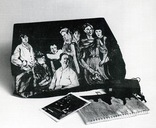
Daniel Kelm' s Thistles and Thorns is another instance of superior craftsmanship. It is a series of surprises, as Kelm has alternated simple ivory cloth and the craggy cast-paper face of the prophet Abraham. Part of the gratifying balance is the unusual box, a three part construction. Its U-shaped poplar wood structures are an allusion to the altars Abraham builds.
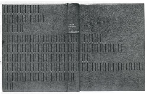
You will need a magnifying glass to study the details of Louise Genest-Côté's binding of What Was Christmas Like in the Olden Days? Its diminutive scale, coupled with the theme, suggests a young child's private treasure.
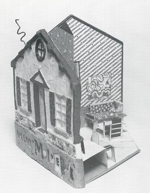
Artists' books are for adventurers. In this category every aspect of the book is open to bold interpretation and any artistic device is permissible in the service of expression. Mary Jo Pauly has fashioned a house shaped book which pops up to become a three dimensional interior of a trendy home. It is a witty commentary on modern sensibilities and through its analogies to the greeting card and children's book excites the viewer's imagination.
Margaret Sahlstrand's Rose Geranium and Kate Abbott's Travelling Book also call upon the association of colourful children's books to add a sense of wonderment. This is especially true of the later. Its generous scale recalls the lap sized books which invited us as children to crawl inside and wrap the fantastic pages about us. Recipe cards, billboards, and postcards will all look new to the viewer after experiencing these artist's books.
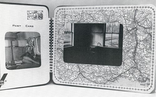
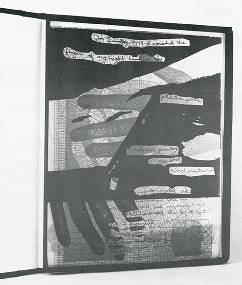
A number of the artists' books have transparent pages. In the case of Colleen Oakes' 10/19/86 the loose leaves are anecdotal x-rays, narrating a printing accident. In Susan Turner's The Square, The Lozenge, and The Triangle, the transparency allows a fuller exploitation of the positive and negative relationship between the geometric protagonists. Sleep Sweet Sleep by Kerry Lee Wiedermann contains sentiments of faith, hope and endearment from Wisconsin gravestones, and by means of Japanese paper inserts presents them in a window like manner. Untitled Box #4 by the same artist incorporates sepia toned slides as a window onto memories and nostalgia.
Transparency allows for the superimposition of images. A similar effect can be attained by the irregular shaping of pages. Peter Sramek folds the pages of In Search of Paradise to offer partial and cumulative views. He has used an Apple IIc computer to produce this limited edition book.
Of all the artists books Françoise Lavoie's is the most daring. It is comprised of a purse, an agenda and even a tape recording. Le réticule tue radically stretches our definitions of what a book might be. Is a book a collaboration of parts? Is it a phenomenon?
Fresh, unfettered, painterly, elegant and exquisite are just some of the words that can be used to describe the decorated papers in this exhibition. They express a sensitivity to the special problems of surface design. It seems ironic that the fluidity and natural ease of marbled paper, are the result of exacting control by the decorator, but such is the case. It takes much technique to make things appear spontaneous and natural.
Judith Welbourn achieves just that spontaneity, through the manipulation of fold and resist dyeing, and by the near magical effects of light bleaching. Her papers possess a rare delicacy of colour harmony and subtle rhythmic composition. The display of Pam and Don Rash illustrates one of the uses of decorated paper. Their marbled paper, combed into the design motif of a curling wave with a gentle graduation of colour, is entirely appropriate to its employment as a cover for Provincetown, a collection of sea inspired poems.
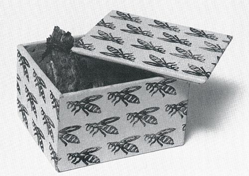
Many of the fine objects in this exhibition take their inspiration from nature, a vast resource for the texture and pattern hungry artist. Lest we forget though, man is not the only paper producer – as Susan Corrigan's composition reminds us. It is a cream paper box, stamp-decorated with an orderly horde of wasps. Inside are ringlets of humble, grey wasp paper. It is a fitting digestive after the visual feast of this exhibition.
TORONTO, June 1988
|
I WAS SURPRISED and pleased to be asked to be one of the three jurors for the CBBAG first members' exhibition, The Art of the Book, and it was a most interesting experience. The organizers did a terrific job preparing mark sheets and sorting and numbering 141 entries. The total number of pieces was projected to be 50, so a marking system was required to guide us in selecting that number. The quality of the entries ran the gamut from masterful to awful, and those extremes were easy to separate. It was the large group of good competent work that caused much soul searching. I believe that the final selection has given CBBAG an exhibition it can be proud of. Deborah Evetts, NEW YORK 1988 |
CONTEMPORARY BOOKBINDING, like most craft disciplines today, finds itself embracing a multitude of diverse intentions and approaches. While the main function of a book's binding has been, and remains, to preserve its pages and present them in a readable format, the ways in which this may be done offer considerable scope to the thoughtful binder. In addition, recent developments in the field of design binding invite the binder to consider the implicit meanings of the book as object. As a member of the jury selecting works for this exhibition I was struck by the large number of creative people striving to master the complex skills demanded by the book arts, and I congratulate them for their commitment and care. As the techniques of binding are mastered, however, it is the quality of the design that distinguishes one well crafted book from another. Among the so-called 'artists' books,' in which the content of the book and the concept for its form are the product of a single imagination, the most successful are those that reflect an understanding of the physical nature of the book. It is unfortunate that the exigencies of gallery exhibition do not allow for the handling of these books. In treating them as objects for viewing only, we lose an important dimension of the book as a very particular format for the containment of ideas. We also miss out on the tactile experience the binder has prepared for us. I can only recommend to the viewer that you choose your favourite binder or book artist and commission a work that you may handle as much as you like. Susan Warner Keene, TORONTO 1988 |
THERE WERE MANY exciting submissions to The Art of the Book and it was hard to choose pieces from amongst much excellent work. I hope we have tempered our judgement with a balanced perspective, particularly in the challenging area of artists' books. I would like to have seen more consistency and greater depth in the areas of box making, calligraphy, and fine printing. Regrettably, the accordion-fold book has become an overworked and tired format, I hope not to see it used as an easy bookmaking solution for some time to come. William Rueter, TORONTO 1988 |
![]()
Acknowledgements
The Art of the Book has been a challenging and exciting exhibition to organize and I owe many a happy debt of thanks. Judith Welbourn, Alan Elder, Glenn Goluska, William Rueter, Linda Joy, Linda Sutherland, and Jennifer Parsons have all made major contributions to the organization and production of the exhibition. The exhibitions committee: John Barton, Betty Elliott, Laura Marshall, Shelagh Smith, Don Taylor, and especially my co-Chair, Susan Corrigan, have all done yeoman's service. The assistance of Robert Muma in providing a receiving point for the exhibition is very much appreciated. The jurors, Will Rueter, Susan Warner Keene, and Deborah Evetts did an exceptional and conscientious job, in what must have been a very difficult task. The organizers of the Halifax, and Victoria and Vancouver venues, Rosanne Foy, and Courtland Benson also have all of our thanks.
The Art of the Book has been well supported financially, and we gratefully acknowledge the assistance of the Government of Ontario through the Ministry of Culture and Communications, The Honourable Lily Oddie Munro, Minister; as well as the assistance of the Ontario Arts Council. In addition the Massey Foundation, and the Ontario Crafts Council have provided substantial support. Finally I would much like to thank the members of CBBAG many of whom responded generously to an early plea for funds. It was very much appreciated.
Adam Smith, CBBAG Show Co-Chair
![]()
Award Winning Work
FIRST AWARD FOR EXCELLENCE IN BOOKBINDING,
ONTARIO CRAFTS COUNCIL DESIGN AWARD
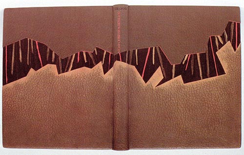
ANNEGRET HUNTER-ELSENBACH, Canada
Gottfried von Berlishingen
Full leather.
30 x 25 cm
1988
Bookbinding
![]()
SECOND AWARD FOR EXCELLENCE IN BOOKBINDING
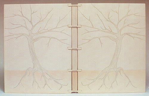
LOUISE GENEST-CÔTÉ, Canada
Arbres d'Errances
Non-adhesive, decorative sewing, full-leather binding. Maroquin du
Cap, Simard endpapers.
35·5 x 25·5 x 2.5 em
1985
Bookbinding
![]()
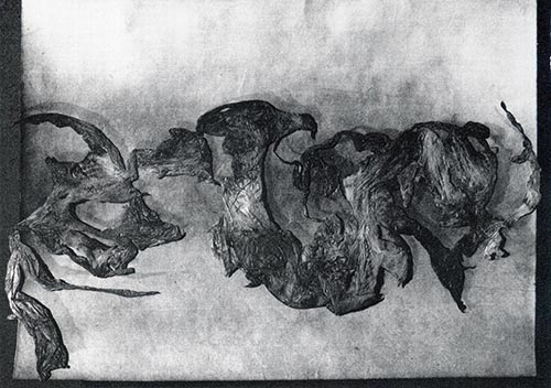
FIRST AWARD FOR EXCELLENCE IN BOXMAKING
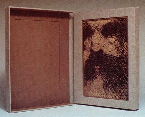
DAN KELM, United States
Book box for Thistles and Thorns
Book board covered with linen book cloth.
20 x 30 cm
1987
Boxmaking
![]()
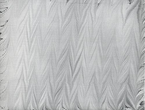
FIRST AWARD FOR EXCELLENCE IN DECORATING PAPER
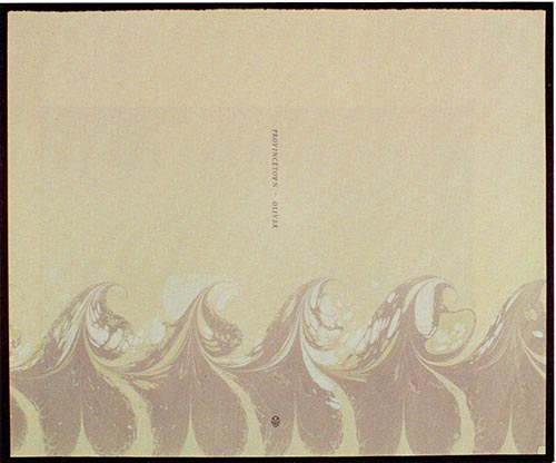
DON & PAM RASH, United States
Provincetown
Marbling on Nideggan paper.
38 x 32 cm
1986
Decorated Paper
![]()
SECOND AWARD FOR EXCELLENCE IN DECORATED PAPER
JUDITH WELBOURN, Canada
Untitled
Fold and resist dyed Japanese paper.
1988
Decorated Paper
![]()
FIRST AWARD FOR EXCELLENCE IN ARTISTS' BOOKS
KERRY LEE WIEDERMANN, United States
Untitled – Box #4
Mahogany box, with slides taken from b&w photos, Xerox text.
6 x 8 cm
1987
Artists' Books
![]()
SECOND AWARD FOR EXCELLENCE IN ARTISTS’ BOOKS
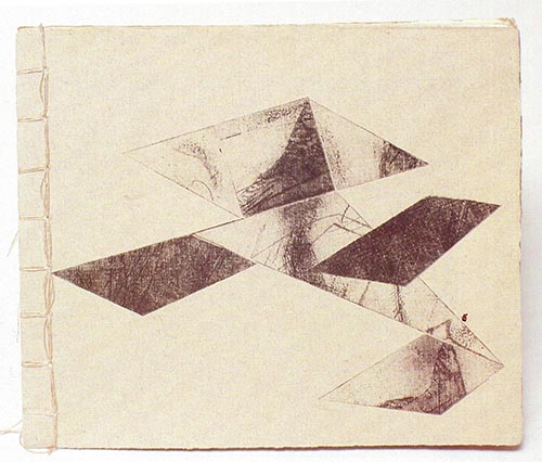
SUSAN TURNER, Canada
The Square, the Lozenge, the Triangle
Intaglio, letterpress, and Xerox on paper and acetate.
21.9 x 26.7 cm
1986
Artists' Books
![]()
FIRST AWARD FOR EXCELLENCE IN FINE PRINTING
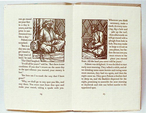
MARGARET LOCK, Canada
How much land does a man need
Handprinted and bound.
28 x 16 cm
1986
Fine Printing
![]()
Calligraphy & DEcorated
PAMELA B. BROOKS, Canada
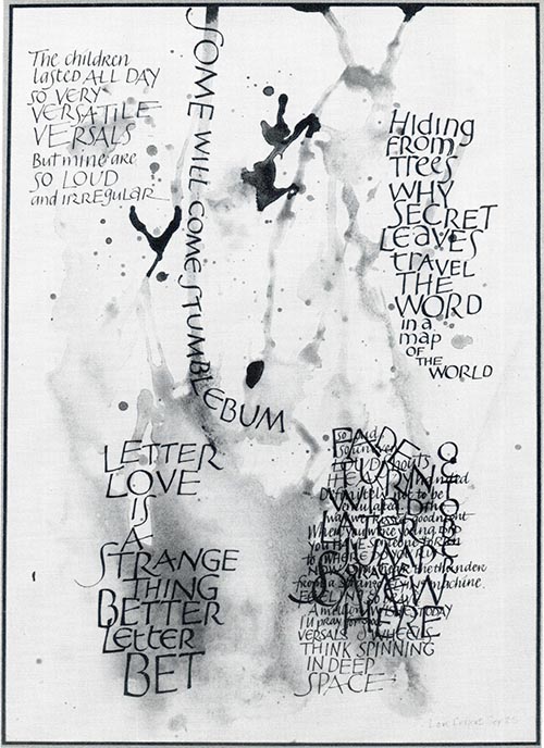
Some Will Come Stumblebum
Inks, watercolours, abstract text, calligraphy.
49 x 38 cm
Calligraphy
![]()
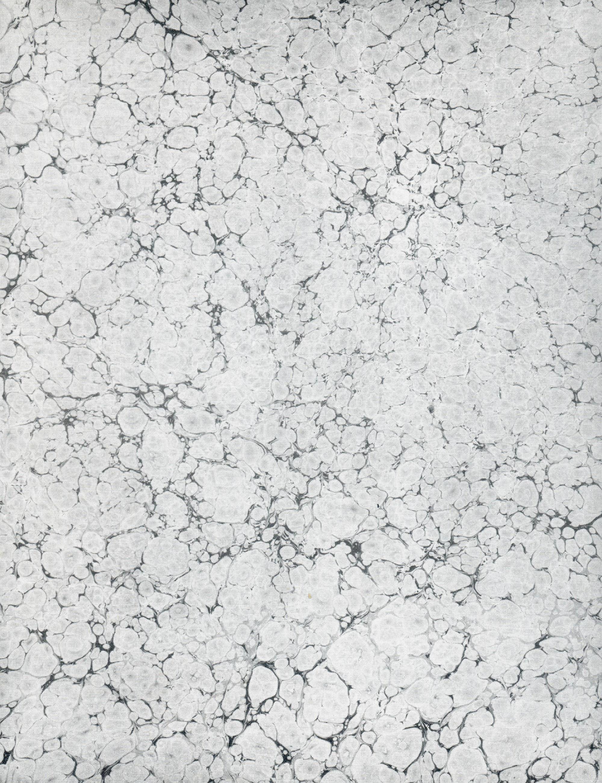
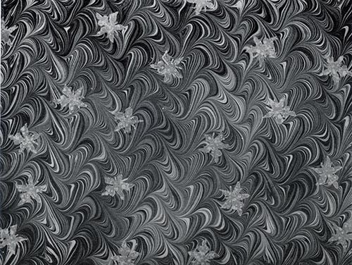
PAULA GOURLEY, United States
Marbled paper
Turkish marbling, paper, and gouache.
48 x 63 cm
1988
Decorated Paper
![]()
PAULA GOURLEY, United States
Marbled paper
Turkish marbling, paper, and gouache.
48 x 63 cm
1988
Decorated Paper
![]()
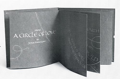
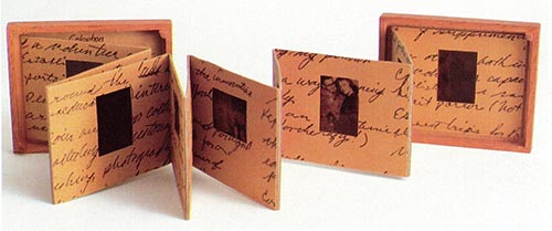
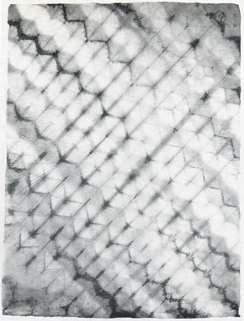
ELIZABETH McKEE, United States
From a Circle of Love
Accordion fold book and case, calligraphy.
14.5 x 14.5 cm
1987
Calligraphy
![]()
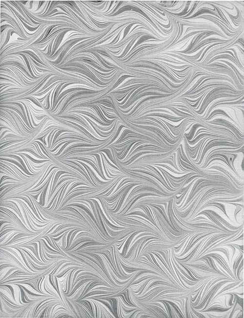
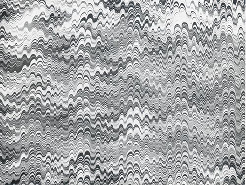
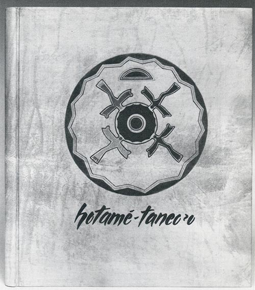
YEHUDAH MIKLAF, Israel
Shell marbled paper
Carragheenan marbling.
50 x 66 cm
1987
Decorated Paper
![]()
YEHUDAH MIKLAF, Israel
Combed marbled paper
Carragheenan marbling.
48 x 63 cm
1986
Decorated Paper
![]()
PAMELA S. SMITH, United States
Floating Leaves
Marbled paper, gouache on Canson.
60 x 46 cm
1988
Decorated Paper
![]()
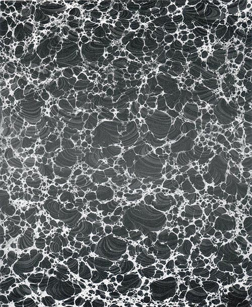
PAMELA S. SMITH, United States
Granite
Paper marbling (over-marble), silver, metallic, and white gouache.
45 x 60 cm
1988
Decorated Paper
![]()
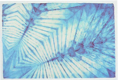
JUDITH WELBOURN, Canada
Untitled
Fold and resist dyed Japanese paper.
1988
Decorated Paper
![]()
JUDITH WELBOURN, Canada
Untitled
Sculptured and dyed gampi, double image on dyed yame, mirage effect through light bleaching.
1988
Decorated Paper
![]()
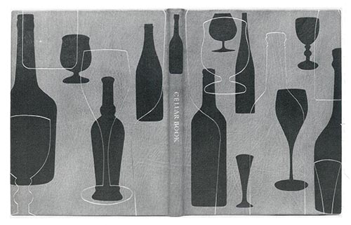
Bookbinding


SIGN UP for email updates
CONTACT US
cbbag@cbbag.ca
https://www.cbbag.ca/connect
82809-467 Parliament Street, Toronto ON M5A 3Y2 Canada
CBBAG Charitable Business No. 89179 5445 RR0001